 Welcome
"Been there, done that." (Source unknown)
I seem to see that, in "Social Media", persons who are interested in some other person's postings "follow" them. Do we want a nation of sheep? Do citizens normally follow their local newspaper or The New York Times? Do people even follow CBS or NBC on the television? Those are mass media with wide distributions, too. Persons "subscribe" to the newspaper.
How did Social Media get off on this anti-civil society thing of followers? I guess it's too late to change the buttons on the webpages from "Follow" to "Subscribe", although, for computer programmers or webpage designers and maintainers, it would generally be a technically trivial fix. But the sheep may not understand what subscribing to anything is, whereas they have a lot of practice in following a leader. Baaa!
I think I can communicate effectively with just about anybody who speaks the English language and who is neither mentally retarded nor a know-it-all (interaction with the former perhaps being limited by their being functionally incapable of talking with another person, interaction with the latter being limited by them being unwilling to do anything other than lecture other persons or boss them around or whatever feeds their narcissism). I also have moderate ability to communicate with house cats.
One very quick item I just now (+2020.12.23 02:00EST) realized: I was filling out a very long and detailed user feedback form. I had a lot to say of great importance to me and maybe to the people whose form is was. When I started I did not know the lay of the land, so I poured out my heart and soul in the first textarea I found, thinking it was going to be "it".
After all that effort, I found as I scrolled further down. that there were almost a dozen more textareas for specific aspects of the issue at hand. If only I had known before I started what I subsequently found out, I would have written the same thoughts but organized them very differently and probably more helpfully for the people whose form I was filling out. Having the different specific textareas as an "outline" might even have helped me produce higher value content!
Rule: If you have a user interface form that is going tto be longer than the first screenfull the user sees, give the user a ROADMAP UP FRONT, so the user can most effectively orient themself if they sincerely want to tell you something of value. And make that roadmap really visually seductive, so that people who do not like to be bothered reading directions will attend to it anyway, to everyone's benefit!
Near where I live is a street that is about a 4 block straight line from a traffic light and then turns abruptly 90 degrees left. There are houses and low-income rented rooms all along the straight part of the street, with possible children and inattentive adults running or blithely (or resentfully) walking into the street, etc. Half-way down the straightaway is a STOP sign, where there is a pedestrian crossing. There is rarely any pedestrian the hours I use the street.
My worst experience here was that one time I did jam on the brakes maybe 15 feet before the STOP sign because a real live child had run out into the road from between two parked cars, not at the defined crosswalk. My car did not hit the kid. I felt relieved. Nobody else being around (and I had looked attentively to try to make sure there were no more of them, after that damned kid had run out in front of me from between two parked cars and almost got me in trouble due to his irresponsibility but kids of any SES will be kids so people say), I had com to a full stop to avoid colliding wiht the child. I started started going watchfully thru the STOP sign. I HAD BROKEN THE LAW AND A [fill in the blank] COP APPARENTLY WITH NOTHING BETTER TO DO WITH HER [fill in the blank] GAVE ME A TICKET FOR NOT HAVING STOPPED AT THE STOP SIGN. The [fill in the blank] did not ask me if maybe there was a rational explanation for my action (per above). Maybe she was having a bad hair day or screaming kids at home from not having get her fallopian tubes tied off before she started reproducing herself. Unfortunately King Vlad the Impaler was not around to skewer the [fill in the blank], and I was stuck with the ticket. Mea culpa!
Every time I go down that street I curse about that [fill in the blank] STOP sign and its [fill in the blank] cop. There is no rational reason whatsoever to stop, so I have to expend a lot of energy focusing on irrationally obeying the law, which entails that if a child did run into the road, I might not see the kid because all my attention was focused on doing the useless thing to obey the Law (are we in a Kafka story?): coming to a F-U-L-L--S-T-O-P for no good reason. I find it difficult to do things that have no good reason. So I curse the thing, remember and get enraged again about my bad experience there and fortunately no kids run into the street.
Solution: Have a "Yield to pedestrians" sign. Then I would probably slow down and look around, as would be reasonable, and if somebody there, stop, else get on with my life. There is a commercial shopping street a few blocks away which has far more pedestrians crossing it which does have such Yield signs instead of show-stopper ("STOP") signs, so apparently the municipality knows about "Yield" signs. But probably the people on this street hopped up and down like rabbits wanting this precious sign, and maybe there had been drivers (themselves and/or their neighbors?) that had recklessly raced thru the place – who knows? Bad user interfaces [rightly] get users infuriated, as here.
Alternative better solution: Put a real red-yellow-green Stop light there. It would still be frustrating, but the reflex response to a Red light is far stronger than to a wimpy sign on the sidewalk, so much less less voluntary(sic) effort needed to obey it. But a Stop light costs money and it would consequently provide [fill in the blank] cops fewer opportunities to write tickets for decent drivers and it wouldn't look as innocent....
So here we have a STOP sign which dolts (and/or enraged mothers) probably ideate enhances their safety or at least their Homer Simpson-ness, but that in reality can cause people to get hurt or killed. A bad user interface.
I sterted counting more things in this website, including not just obvious things like number of hyperlinks but also more obscure things like unreferenced "id" tags. I like hyperlinks and their number is around 9,750. So now seeing the number, I want to bring it up into 5 digit, not necessarily for any reason other than the number. The number of unised "ID"s is around 1,200, so I want to get them down to 3 digits for no other reason than the nubmer.
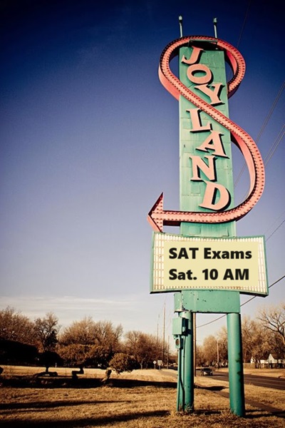
This is harmless in counting links and tags in a personal website. But if I was doing urban planning or conducting a war, the consequences could seriously affect persons' lives. The influence of one of my least favorite charities on America life has indeed been substantial: Educational Testing Service (ETS) (501)(c)(3), Princeton [why not Newark?] New Jersey. A difference between 699 and 700 on an SAT sounds like more conequential than just 0.00143, doesn't it? And then you get people who become "bean counters", in positions of social power.

